What’s not to love about theater posters
I did some pro bono work for a local theater a few years back (Mosaic Lizard Theater in Alhambra). Probably worked on 3 or 4 different productions over the years.
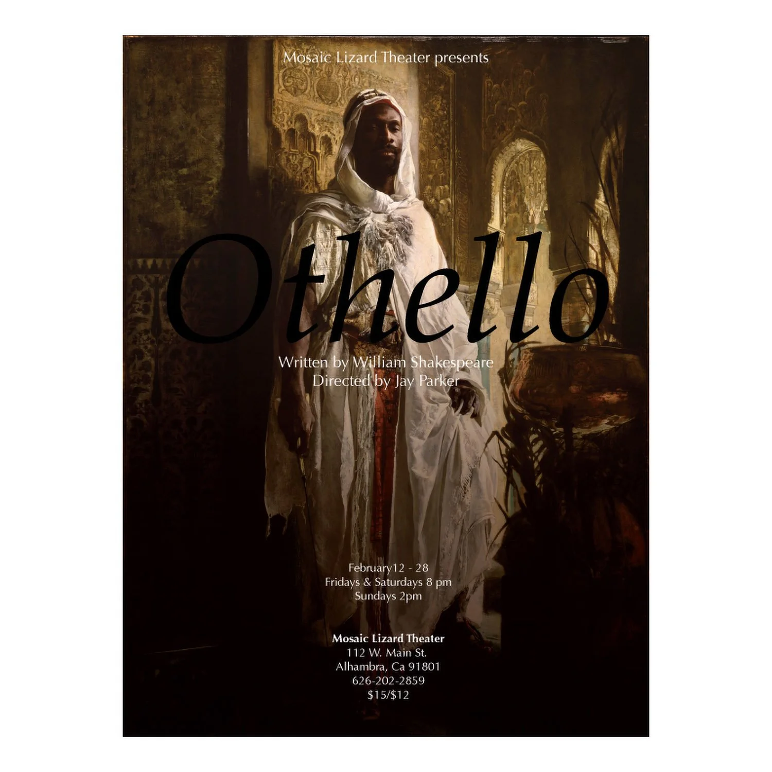
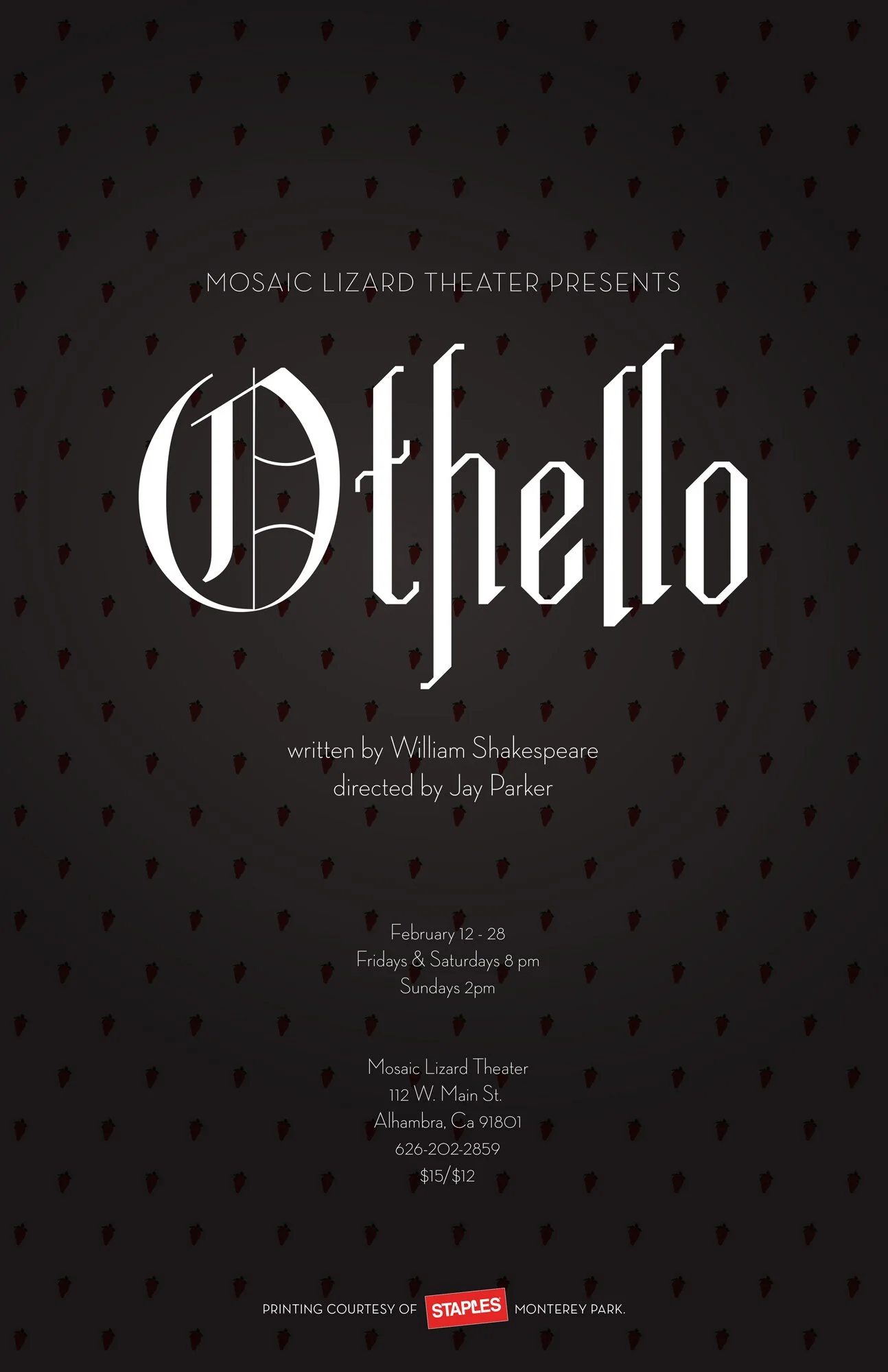
Othello was my favorite. I got pretty nerdy with some of the options, imagining what would it look like if it was at Sierra Madre Playhouse, or Dorothy Chandler, or some black box hole in the wall on Melrose.
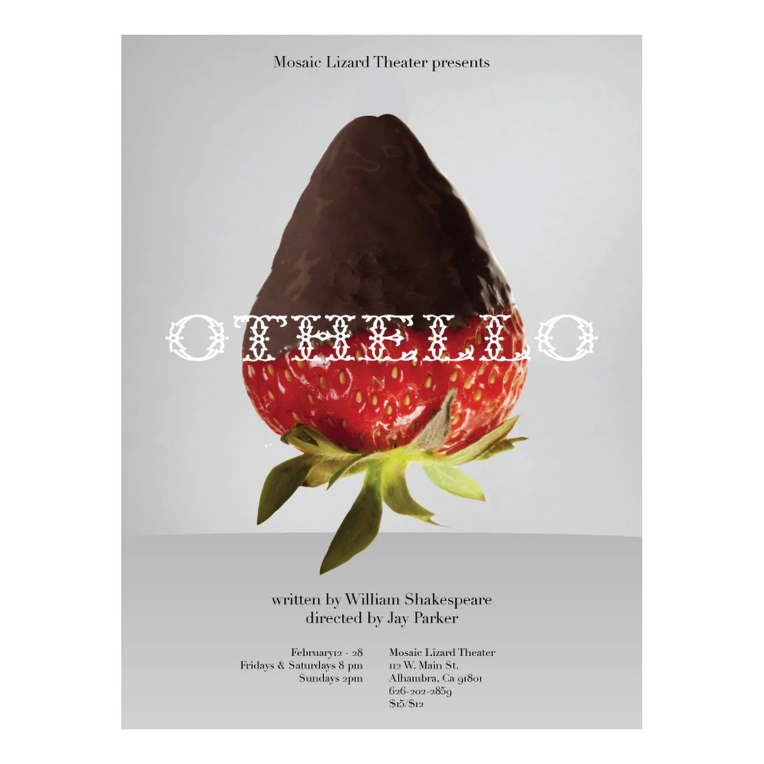
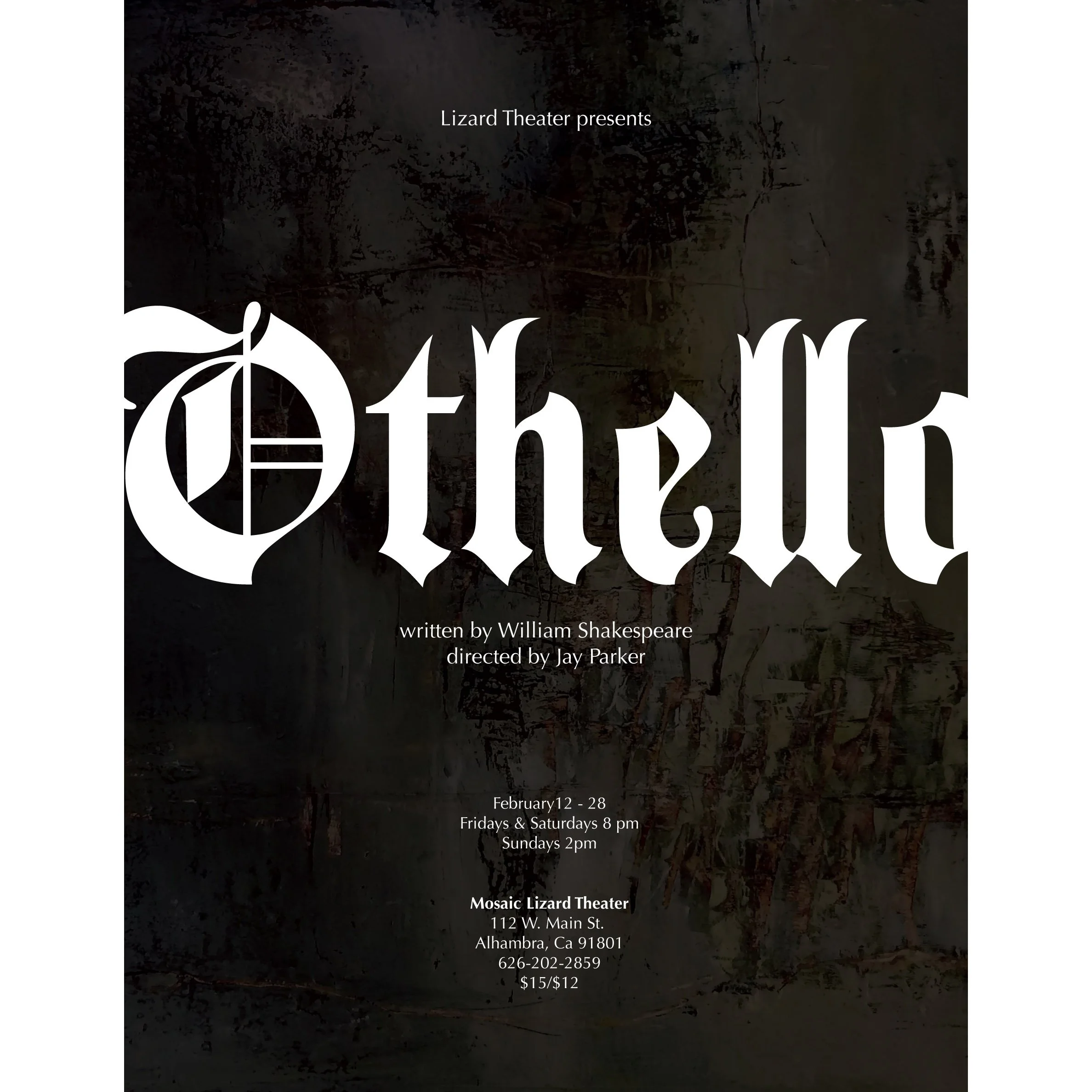
I watched the play to get some inspiration. Lots of interesting themes in there to play with. The strawberries, the contrast of dark & light, the taboo of inter-racial relationship. I also looked at a wide variety of other designers take on the subject as Othello has been produced thousands of times from local theaters to Broadway. Lots to draw from there.
They wound up choosing a pretty conservative option with some nice type that was simultaneously old and new. The bold blackletter font has a modern geometry that freshens it up a bit. The background repeat are strawberries which reference themse from the play.
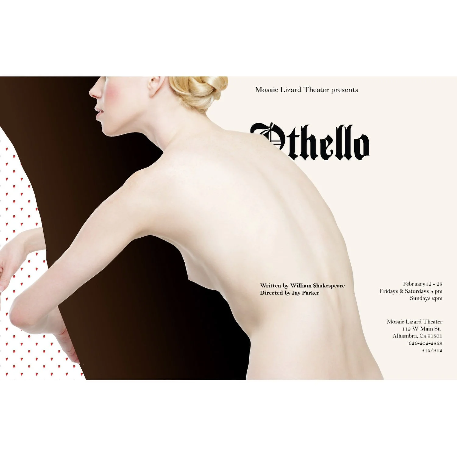
Below are some of the alts. I particularly like the risqué asymmetrical one that I imagined at a more avant gardé space like REDCAT.