Illustrations & infographics
UX design us mostly about user flows & interface, but with some projects I’ve gotten to stretch out and get back to my visual design roots. These are some samples from throughout the years that I think turned out pretty well.
Here are some icons for Walmart MoneyCard that I illustrated to supplement their new style guide that came out while I was working on the project. The top row which I found more interesting, and the bottom row the ones that made it to production.
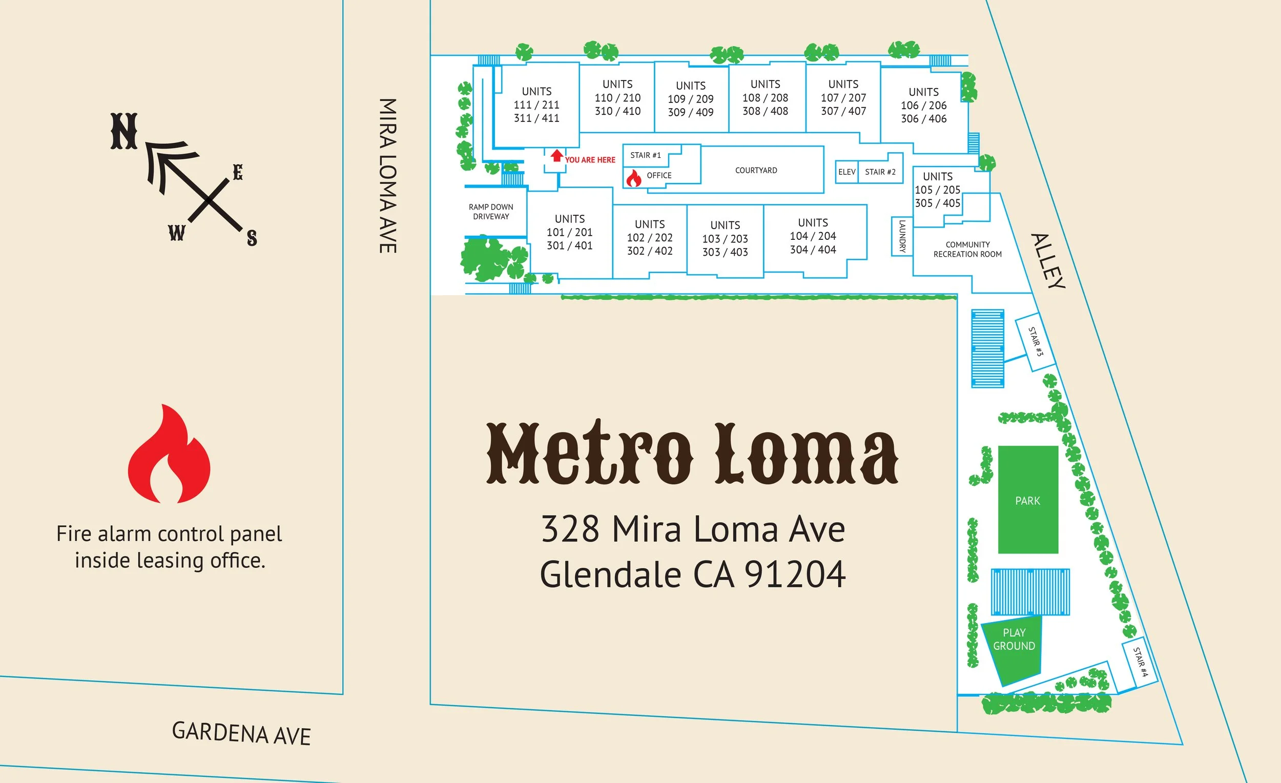
Wayfinding map
For a construction/architectural project I worked on last year. Pretty basic. The important points for this project were clarity & simplicity. The original map was hung in the wrong orientation. That is to say the map was not oriented to the direction the user was facing when reading it which made directional calculations difficult. Color choices were dictated by the overall palette of the property.

Kitch with character
A buddy was starting an ice machine franchise and wanted a simple but memorable identity for his business. They chose the name “The Iceman Cometh” (surely not aware of the dour character of the play) so I came up with this happy little guy for t-shirts & ads.
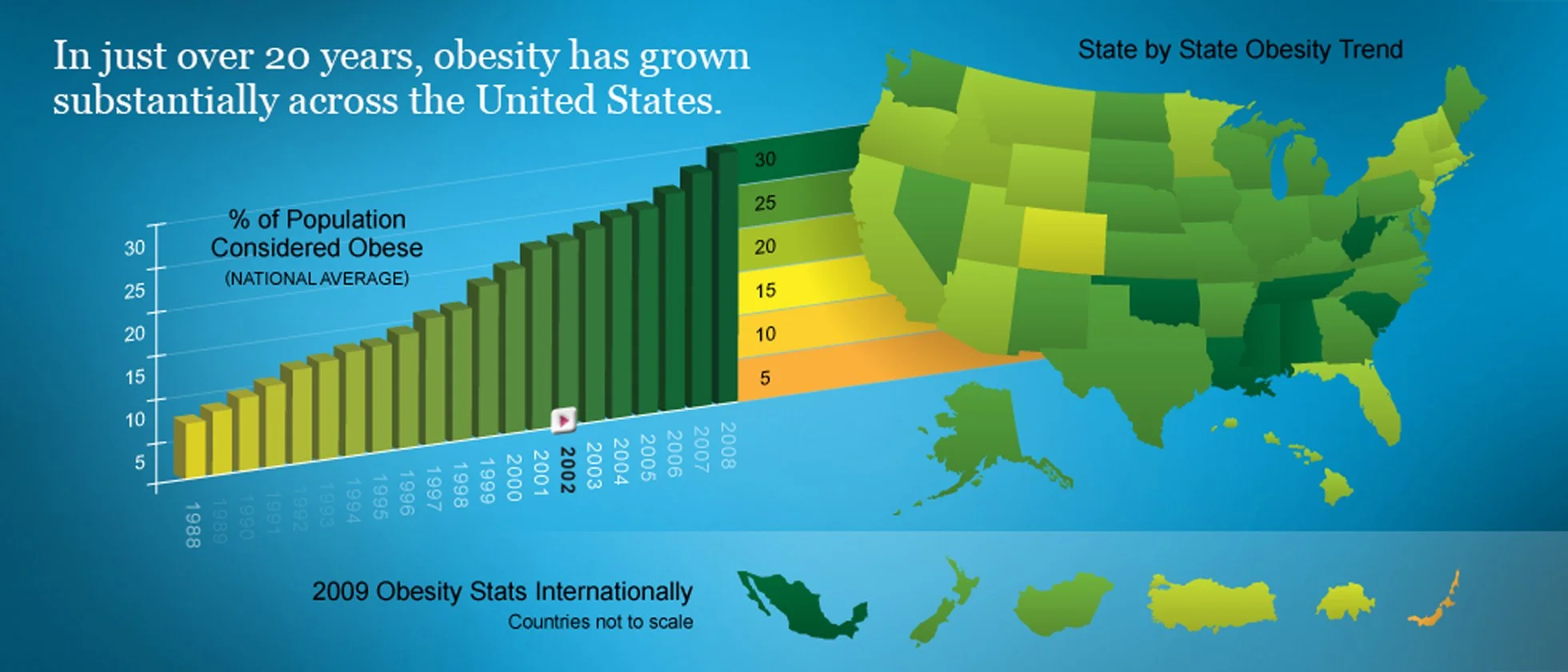
Infographic
In 2008 at Participant media I art directed & designed a series of interactive modules on issues from the social to the political to the environmental and often added these complex infographics to support the narrative.
This one was about obesity stats over the years broken down by state. As the user interacts with the slider on the timeline you see the colors of the states change.
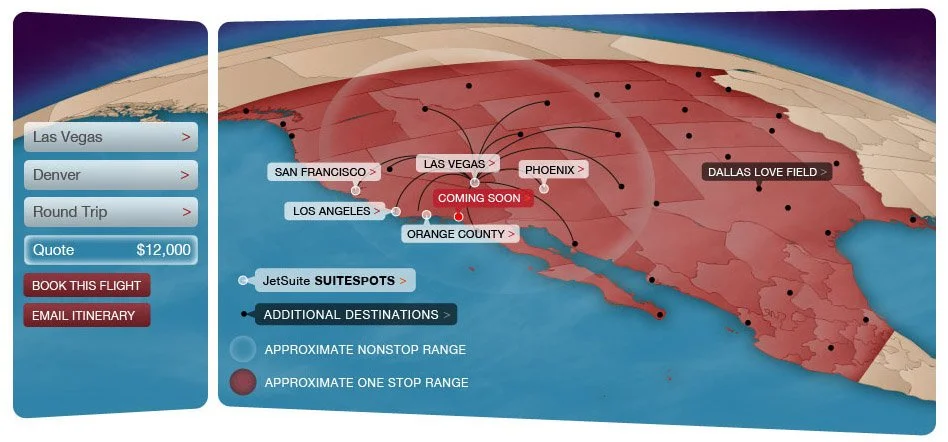
Interactive map
JetSuite is a private jet company. This interactive map showed the cities they serve and possible connections from each.
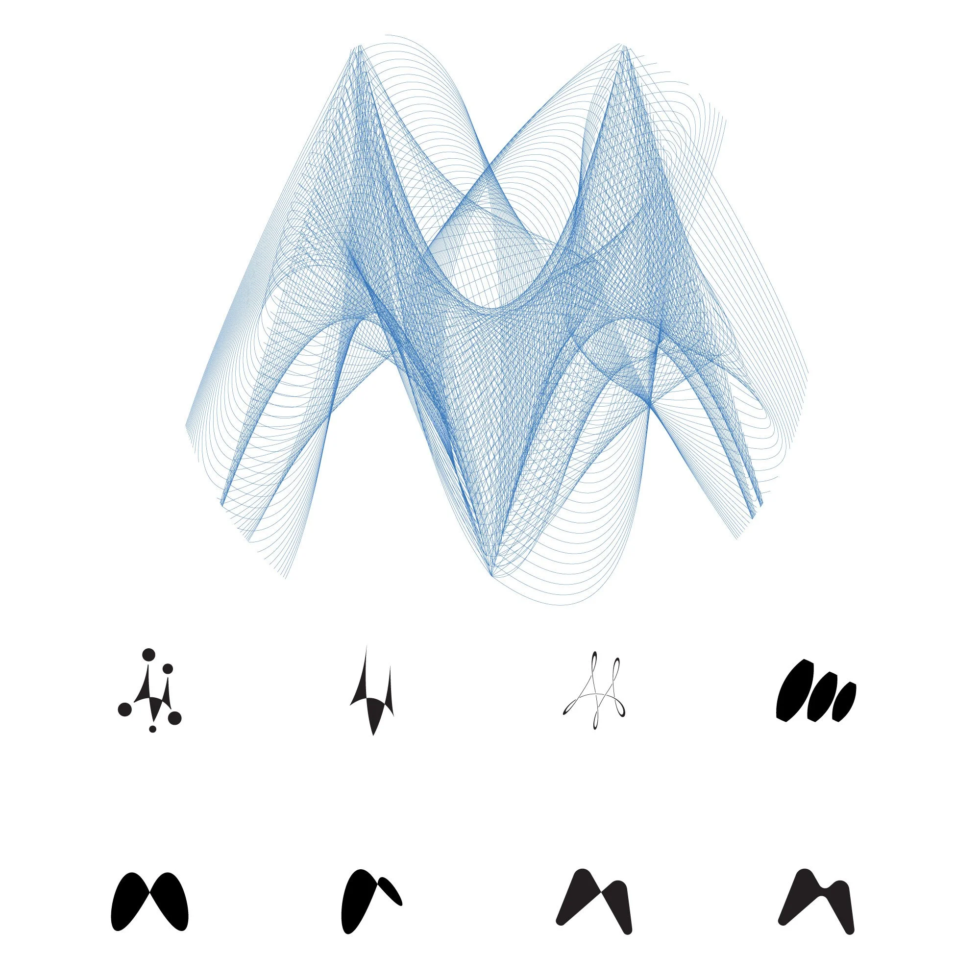
Identity illustration
At SiegelGale we were pitching the Motorola account. Super fun project. I got to do these logo concepts for the pitch that have a fun illustrative feel. We wanted something that felt simultaneously forward looking, but with a nod to the company’s past. I leaned into a retro-futuristic direction, simple abstraction, very geometric.
I love how the bottom row feels a lot like Meta’s infinity logo from a few years back.