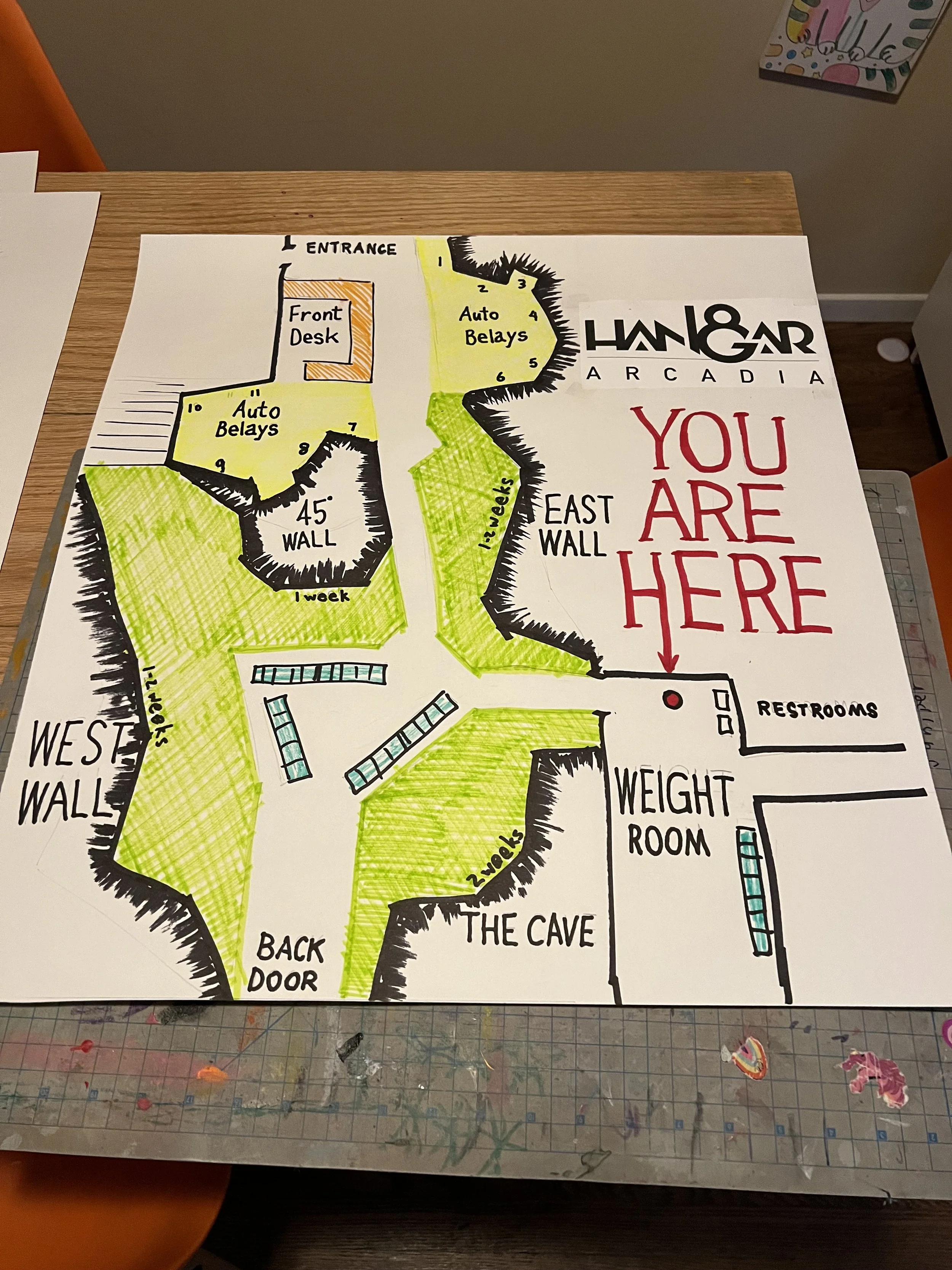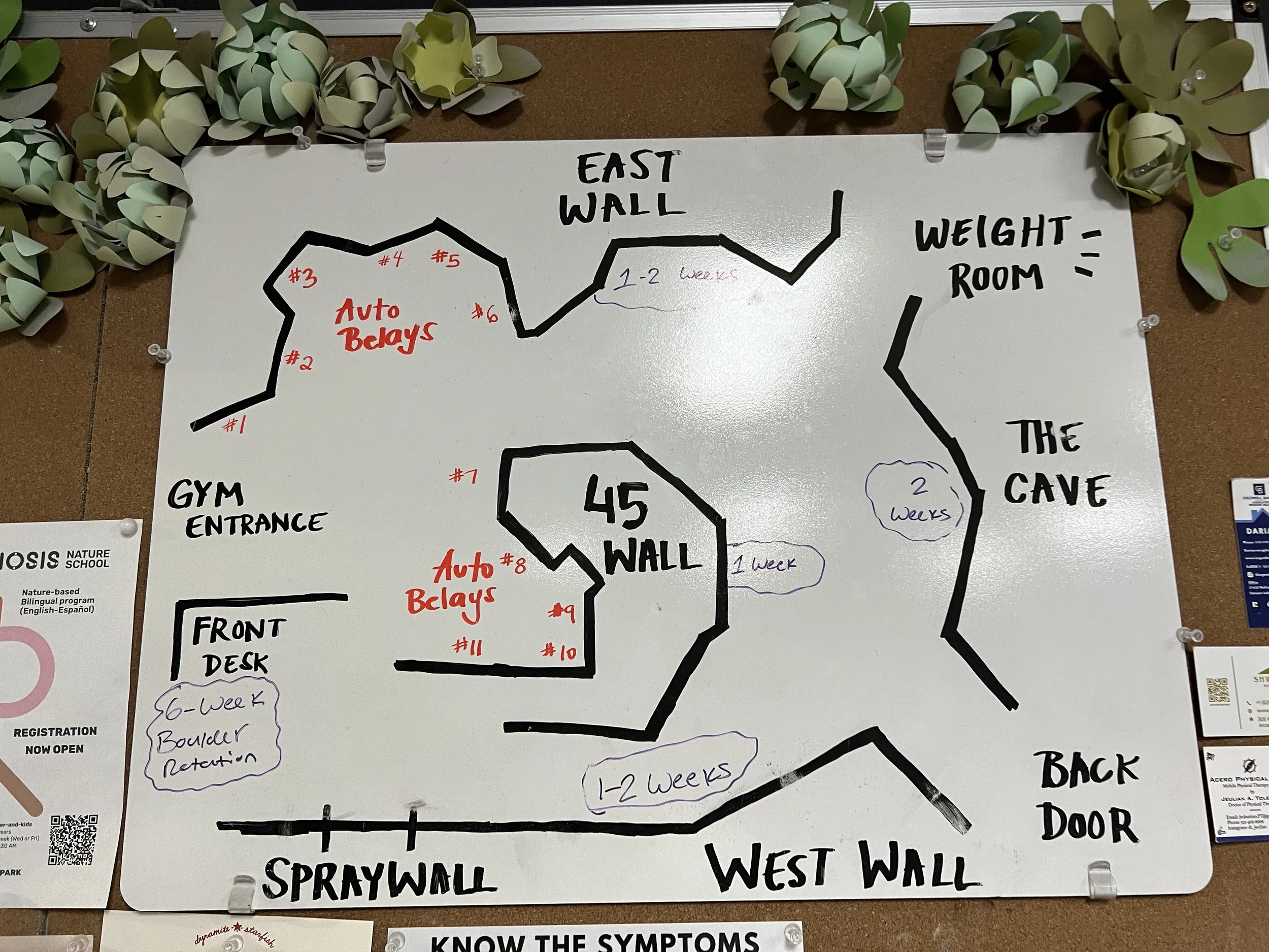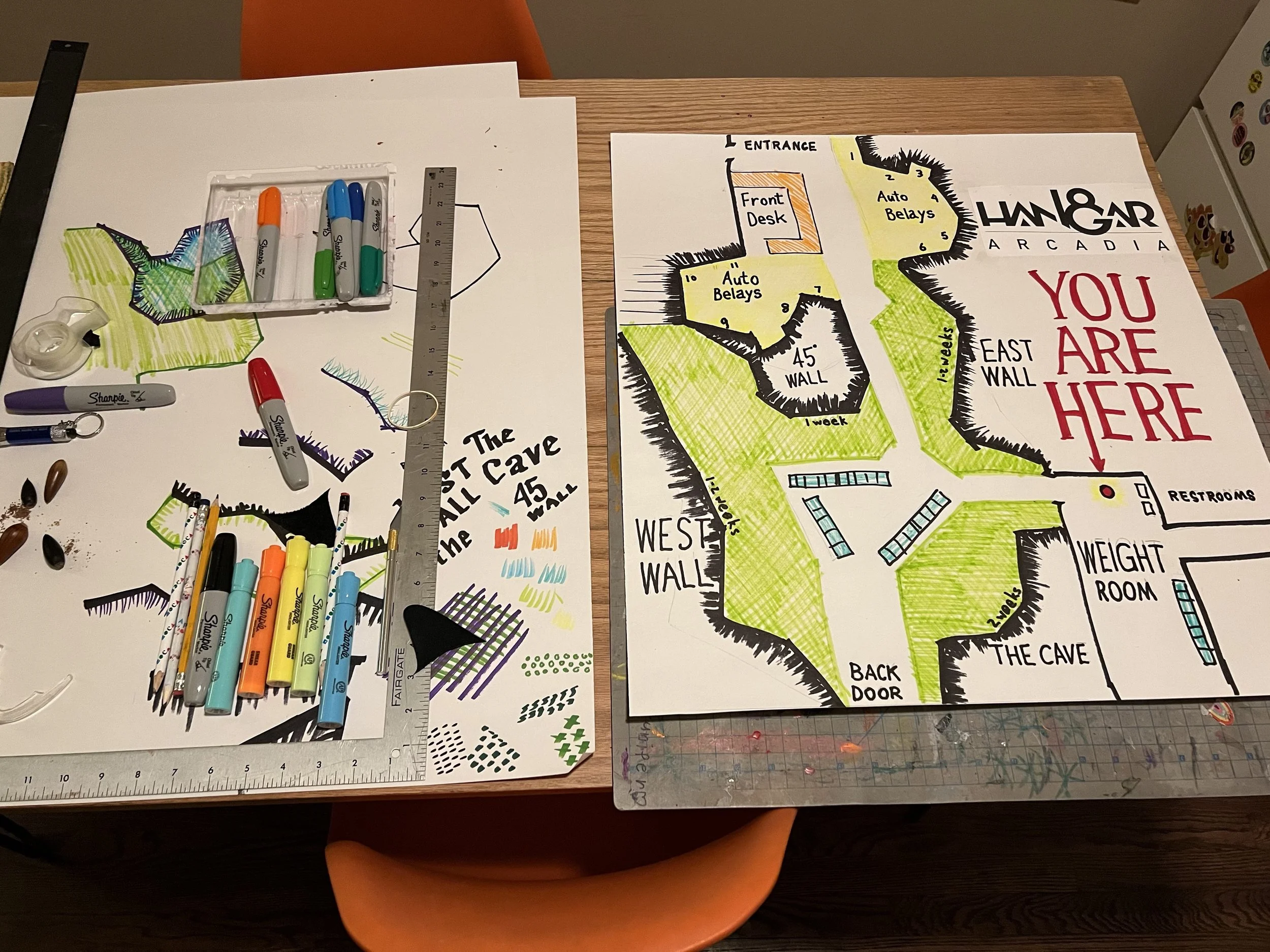
Their wayfinding map was oriented wrong. I just couldn’t stand it.
User experience in wayfinding
The folks at my local gym had dry erased a rough layout of the space on a whiteboard hung on the bulliten board at the back of the property. Don’t even get me started on why they put the wayfinding map in the last room you get to after completely navigating the space. Maybe they’re rock climbers and not graphic designers.
When designing wayfinding signage it’s important at the least to consider the direction the viewer is facing & where they are on the map. That saves you doing a bunch of mental geometry. Their drawing of the space was pretty close, but not really proportioned properly or actually complete.
I made my own version oriented to the way the viewer was facing and added a bold “YOU ARE HERE” to make it more useful. I thought my marker rendering was a fun addition to the very hand-crafted experience of the space. Then I rolled it up and just gave it to them.
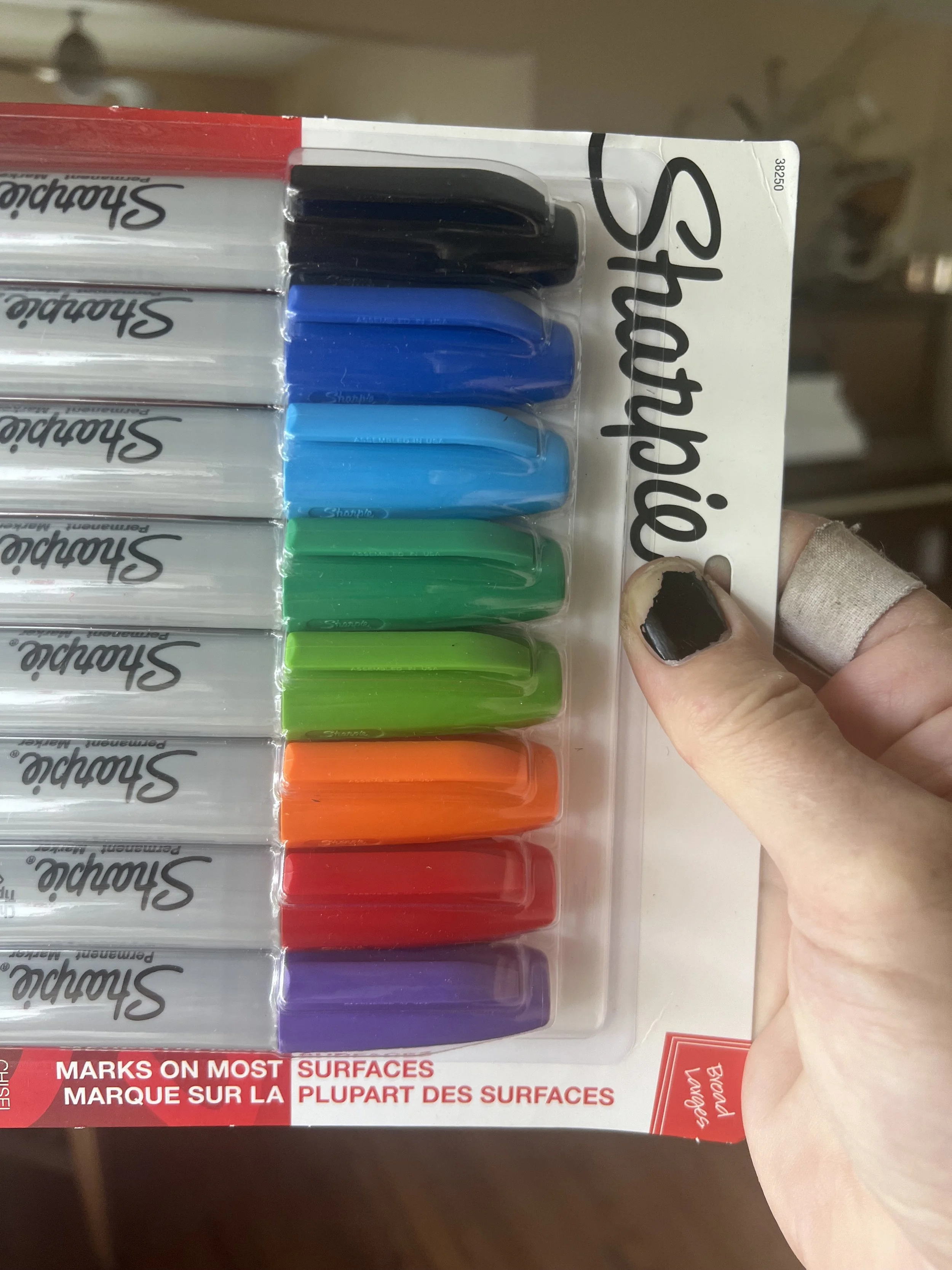
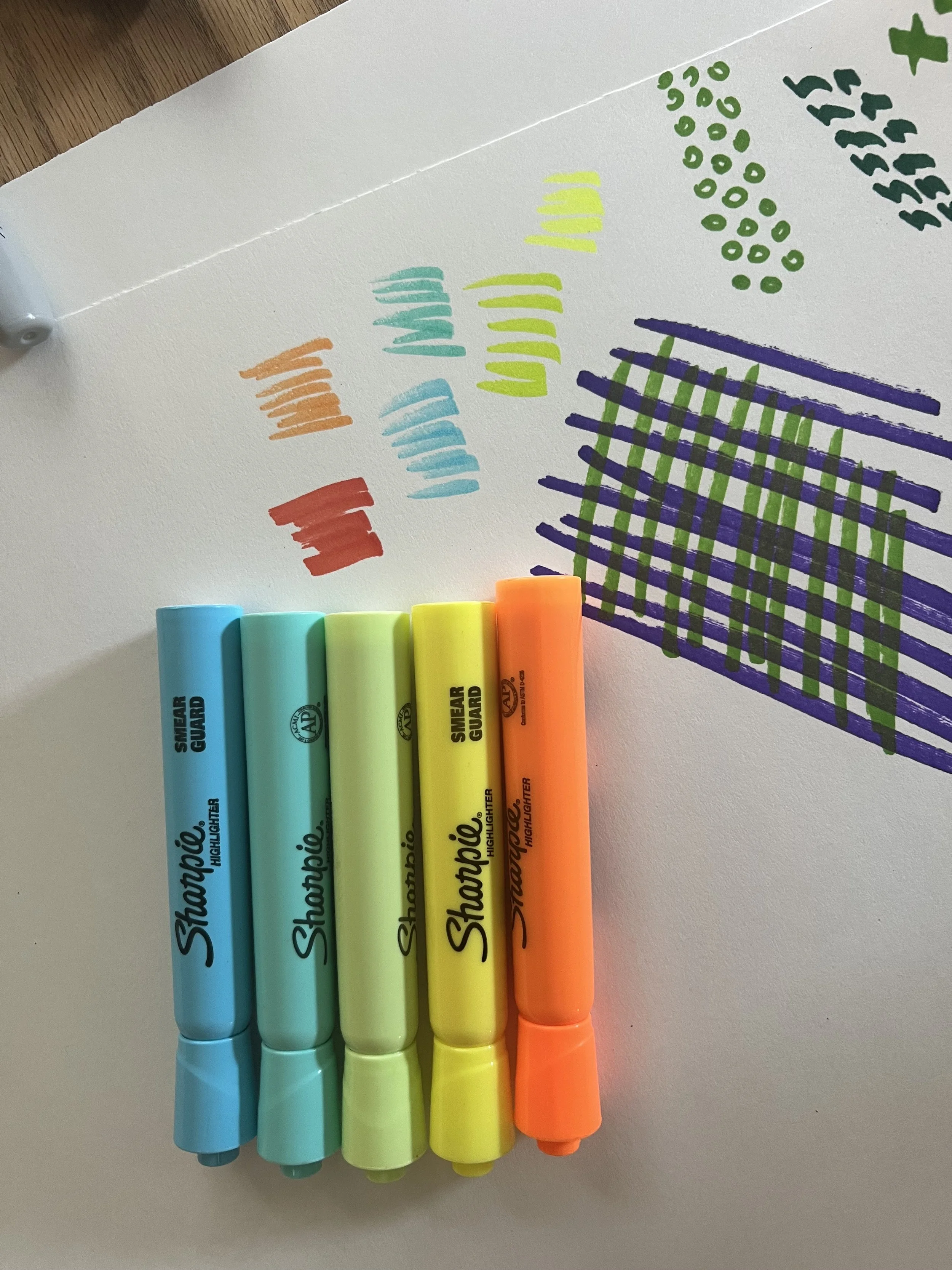
Sometimes you just want to get the markers out & have fun.