Neara . . .
AI-driven relationship building app
Got contacted by a former colleague to do branding, UX & marketing strategy for a new app idea he was developing. In addition to using AI on the backend to handle the apps internal logic, he was also using Cursor/Xcode/Linear/Github to manage the development process. With a couple of advisors & me for design he had the team he needed for launch.
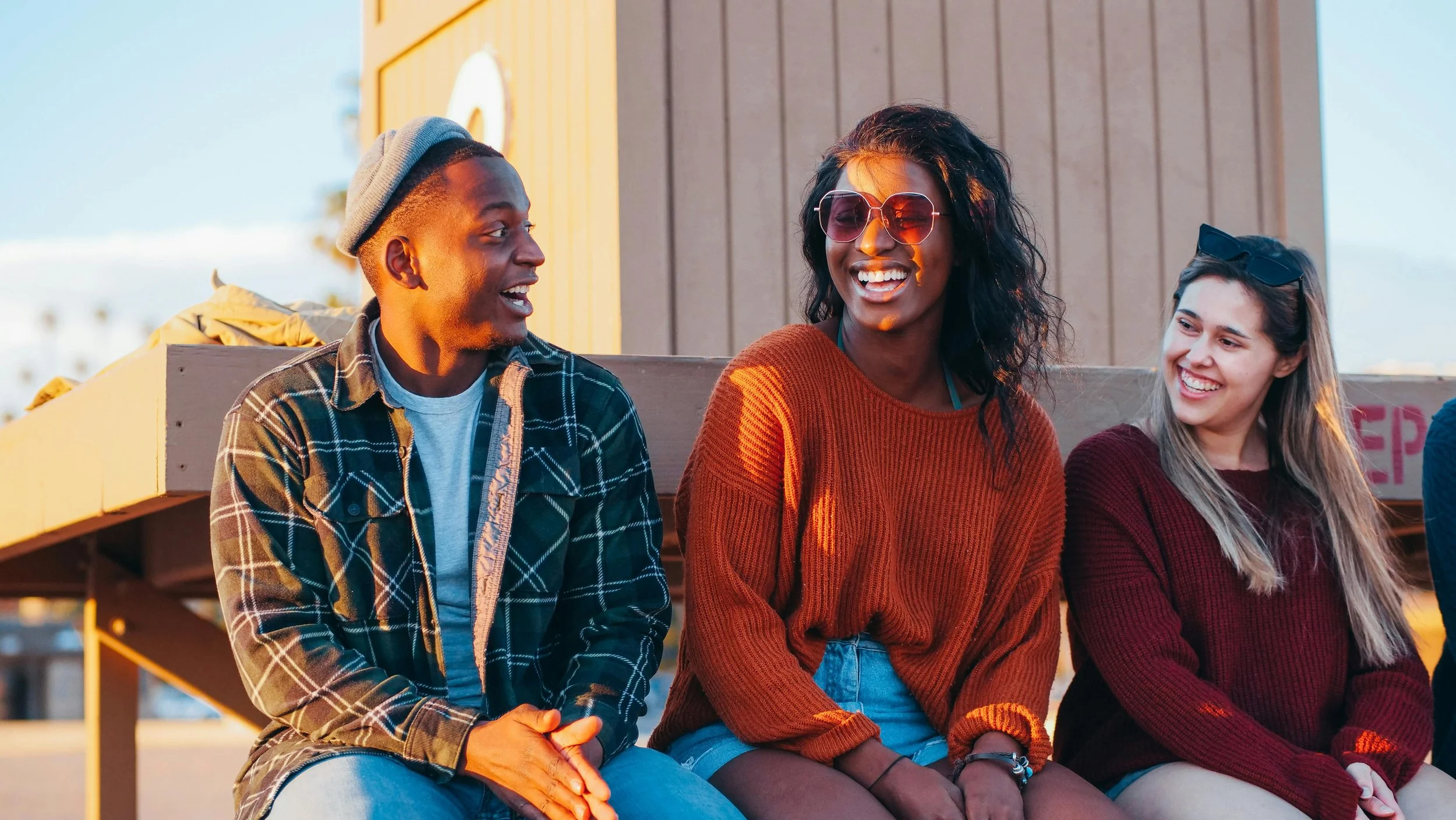
We all have way too many contacts, people we’ve lost touch with, others we don’t remember meeting at all. Neara is a simple app to help with this problem. By guiding you through a simple interaction with a small handful of important contacts each day, you tend your social or professional circle to pull out those that matter most.
The founder had a functioning proof-of-concept app that captured the basic idea. He brought me on specifically to imbue some personality into the project.
Naming & typography
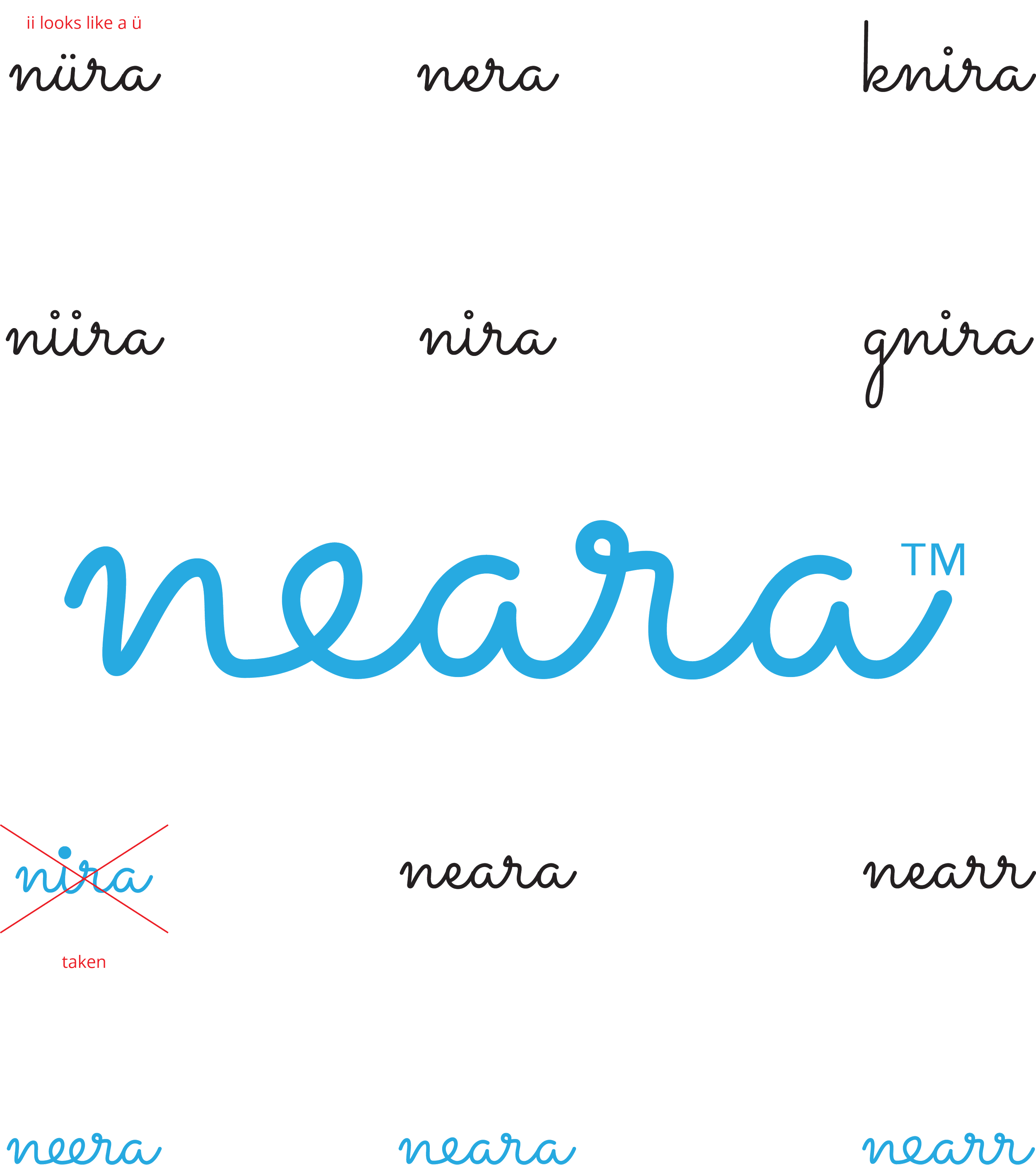
The original name was "BeFriend." It said what he wanted it to do, but it felt clunky. Too literal. Had too much baggage attached to it.
I played around with ChatGPT to brainstorm names — pushed it to go abstract, play with spelling and pronunciation. Out of about 20 options, "Neara" resonated most with the team. It described the underlying goal of the app : to get nearer to those who matter most. We played with variants while running trademark searches until something stuck. I’m still particularly fond of “nearr”, but that one didn’t fly with the team. Little too “grrr” I guess.
I played with a handful of variations for the logo in different fonts and landed on this nice flowy script (Sacramento) that would also work for heads in the app. Wound up redrawing the whole thing by hand to get the letters to connect properly and for the whole thing to work as a unit.
I fussed with that e for a couple of hours. It still looks a little off to me, but everyone else I showed it to seemed to think it was working. In design there are those times where you just wonder “am I seeing something”, so it’s good to get reality checks from people you trust. With my agency background I had a lot of accomplished designers to poll.
Design as product development
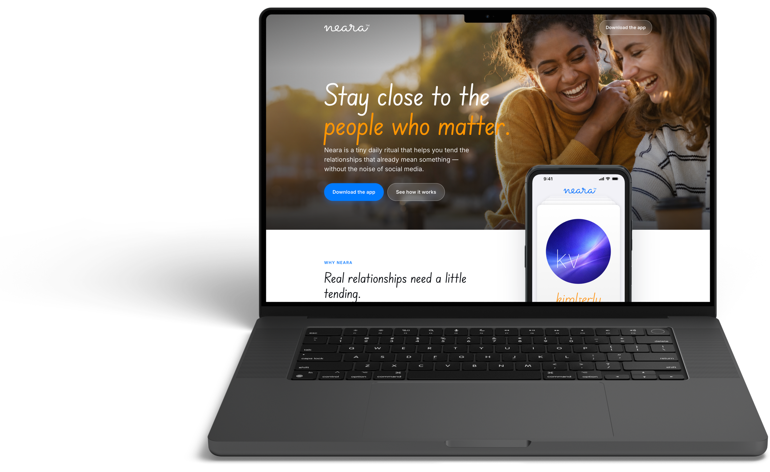
When I was with Bluecrew, a common way to develop a concept & get your ideas seen was to create a PRFAQ (an old Amazon tactic). For the unfamiliar, it’s a press release with FAQs that not only helps the ideas sponsors figure out what they’re really doing, but then becomes a tool to socialize the idea. We used that same approach with the landing page.
Cursor roughed out a passable landing page (more on that below) and then I started tweaking it by prompt & by hand. Passing it back and forth among the team helped us identify communication needs and consequently app functionality.
A prime example is Security. We realized it’s a lot to ask people to import their contacts. We’ve all gotten a little used to it since Facebook & Google as us to share so much even to do something simple, but we wanted to set a higher bar of expectation for the user. We added the content to the landing page that laid out our basic position on security, and then built some safeguards into the back-end to make that promise true. That work became our landing page for the site & informed the content strategy for our Beta email.
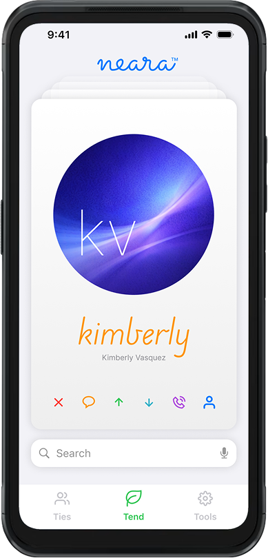
The original app

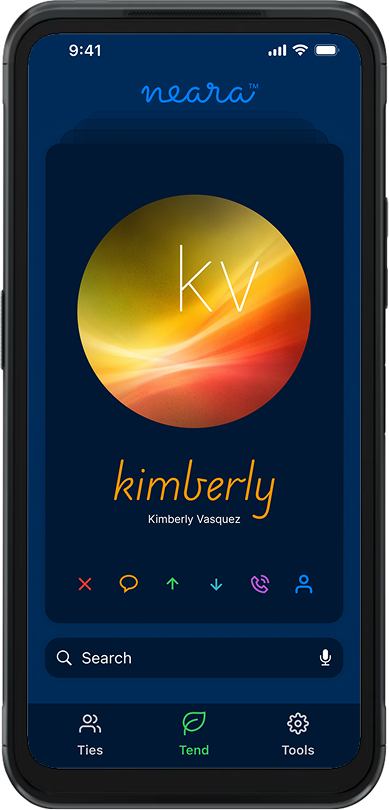
My new design
The UX big move:
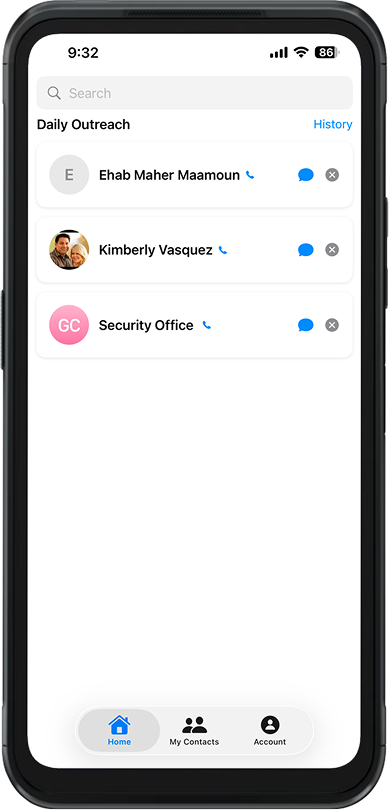
card stack instead of lists
When you're scrolling through an alphabetical list, there's nothing engaging. It's friction. I looked at other apps that involve quick decisions with a yes/no methodology — TikTok, dating apps, Instagram Reels — and thought: what if this felt like those apps? Can we make it a little more fun?
I pitched a card stack UI. Instead of scrolling, you flip through cards. Each day, a curated set of contacts surfaces as cards. Swipe yes, no, message, call, dismiss. One action per card. Simple. Frictionless. Actually fun.
There was additional logic in there to resurface yeses from the day before, secondary options for already seen people & a bunch of other nuance to keep that primary activity feeling live & varied.
When he saw it, his face lit up: "Now it's fun." That one interaction model became the north star. Everything else followed from that.
Simplifying without losing power
I was obsessed with keeping the friction low. One tap, one decision per card. All the actions live in a button bar on the card itself — message, call, dismiss, info. No modals. No cascading decisions that make you feel like you're filling out a form.
But here's where I got a little clever with the dismiss function. The first time you swipe someone away they just swipe away – no perceptible change to the user (we re-rank that person on the back end). Second time, still nothing. The third time, we ask why — and then they're gone for good. It’s an unobtrusive to record the degree of “no” and give people a chance to reconsider based on how they’re feeling at the time. Everybody has those “no” days.
This isn't just UX theater. It builds confidence to engage : users learn they're not going to face an endless chain of qualifying confirmations. One of the things we’re trying to combat with this approach is decision fatigue. The “second chance” concept respects the users’ emotional instincts while protecting them from themselves.
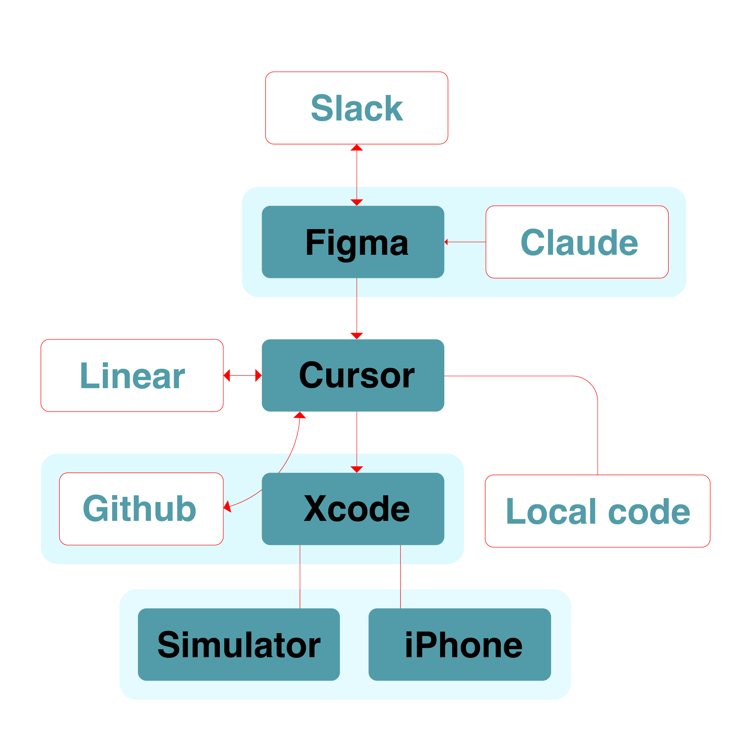
Working with Cursor
(and learning fast)
For the landing page, I roughed out the key topics and asked Cursor to take a first pass. After the initial effort giving ChatGPT the same task (it failed miserably) I was skeptical honestly, but it actually worked. It seemed to be using all the previous coding prompts, app knowledge, all the input from the last 4 months was represented in the copy. I spent an hour refining it — adjusting copy, tweaking layout — and had something solid ready to share with the team.
For the app itself, I learned to think differently about the whole design-to-code flow. I'm not writing tickets anymore. I describe what I want, Cursor builds it (and writes the ticket in Linear), I review, we iterate. What takes 2 week in a traditional sprint (and possibly 2 sprints) takes a day. Maybe less.
AI is incredible at coding but kinda naive about design. The card stack took several iterations — its first attempts were honestly embarrassing. But by breaking the problem into pieces and iterating, we got there.
What's next?
We’re getting all the pieces in the right place, and with Cursor it’s happened in a couple of months rather than a year. I was shocked at how fast the landing page came together. I thought I'd have to rebuild a lot of it, but Cursor's first pass was competent enough that I just refined. That wasn't nothing.
Also surprised by how quickly the swipe interaction became the thing. It's barely been three months and it's everywhere in our conversations about Neara. He was right: fun sells.
Neara's approaching Beta. The app is nearly ready. The landing page is coming online. The app store presence is coming together. Next phase: real users, real feedback, and refining based on how people actually use it. Oh, and social. And paid search. Oh, and the ad networks. So much fun in store yet! Can’t wait to do the TikTok ads!
The vision's clear: make relationship management feel less like a chore and more like reconnecting with someone you actually care about. One swipe at a time.
There's something satisfying about that. You're not managing your contacts like you're managing a CRM. You're just tending to those who matter most.