
Walmart MoneyCard marketing site redesign

A new look for the whole platform
At Green Dot, the UX team had just finished designing and building a custom responsive web framework (nice work, Don Osborne) and had begun the process of converting all our customer-facing marketing sites from their old, disparate designs to this new common framework. After our own internal brands were done, we started turning to our partner brands to show off the new framework.
While it was a separate project altogether, we also pitched new designs for the post-login account management experience as well (left).
The new design
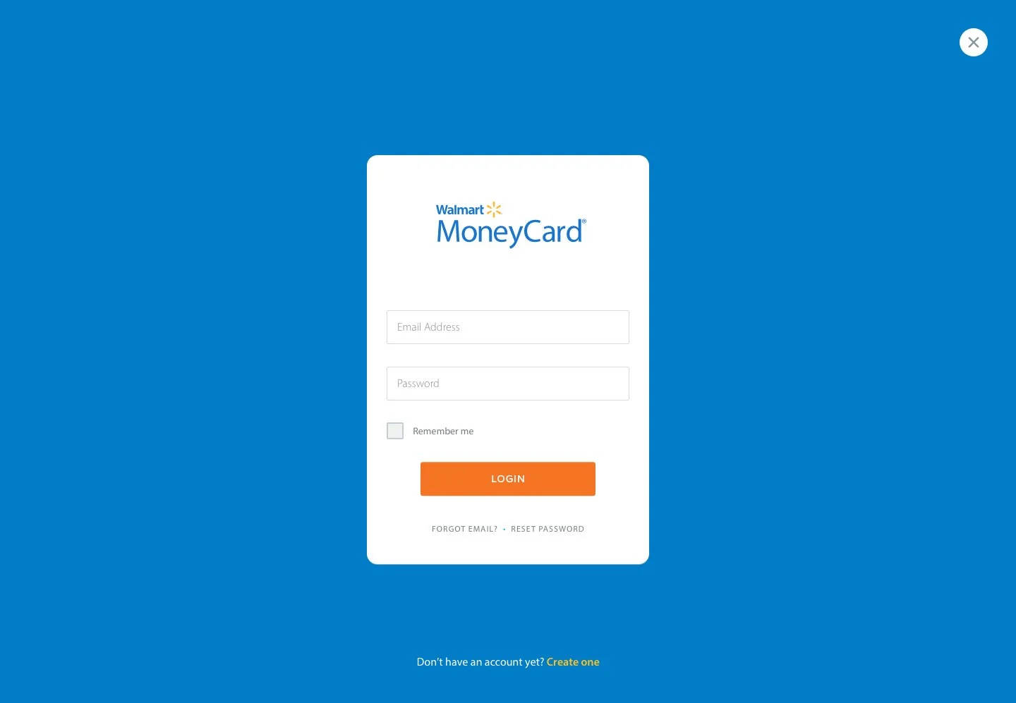
Using Walmart’s Third Party Design guidelines as a starting point I began reworking the entire site page by page. At the time they had just revamped their marketing guidance to compete a bit more directly with Target. They called for bolder use of color, a more modern aesthetic in photography and illustration, and a more dynamic presentation even in the smaller places as demonstrated in this Login page.

Understanding the process
Between our own internal stakeholders and the gauntlet of Walmart reviewers, I knew this new design was going to have a much better chance of going live if I kept the content changes to a minimum. I got a few updates from Marketing for language that was already approved and kept the rest as is. There was budget for photography so I decided that was the greater opportunity to make the most impact.
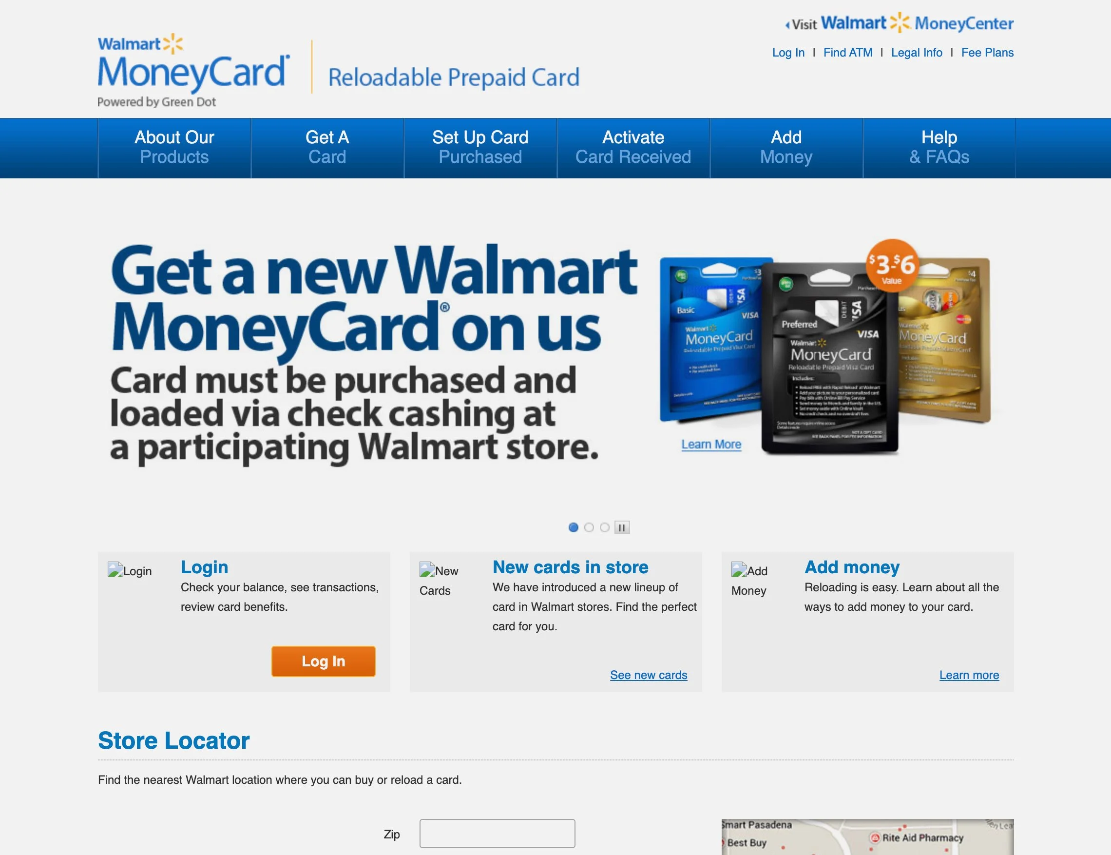
The previous design from 2012
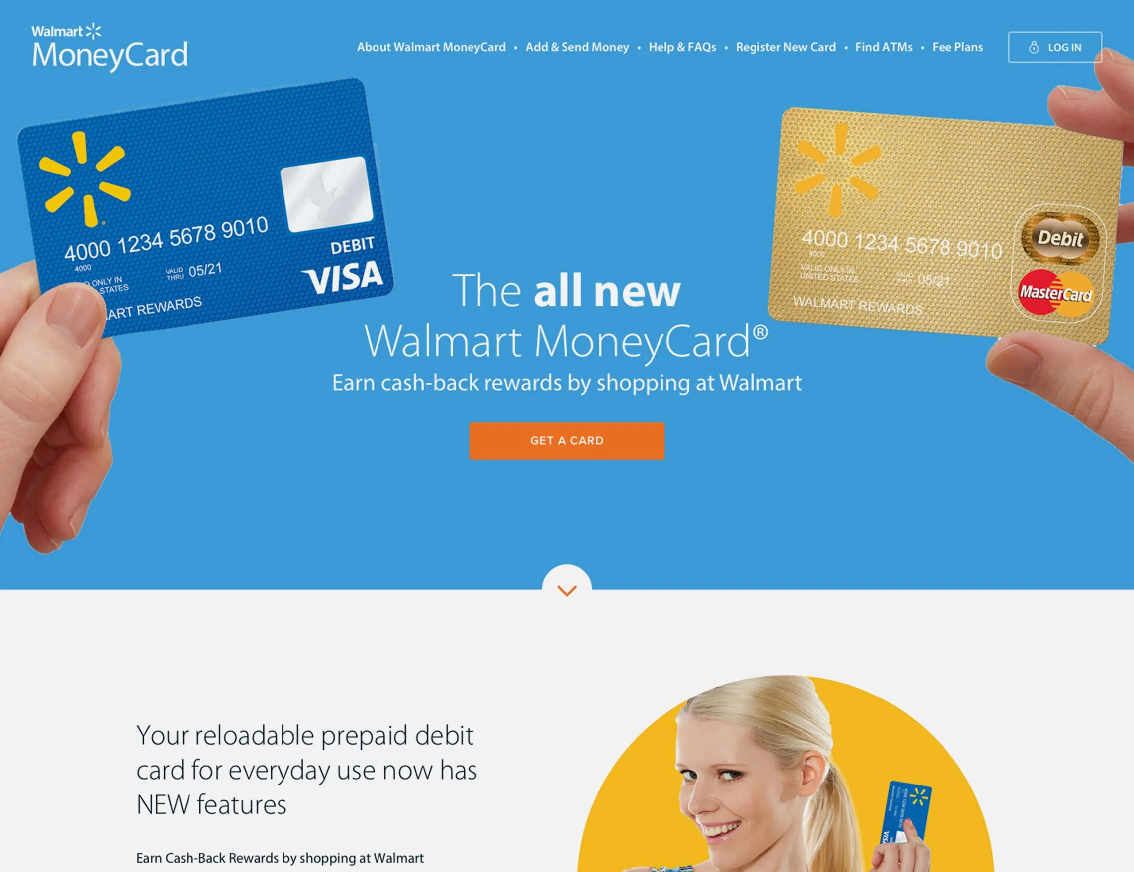
My new design from 2016